
Clarity Campaign
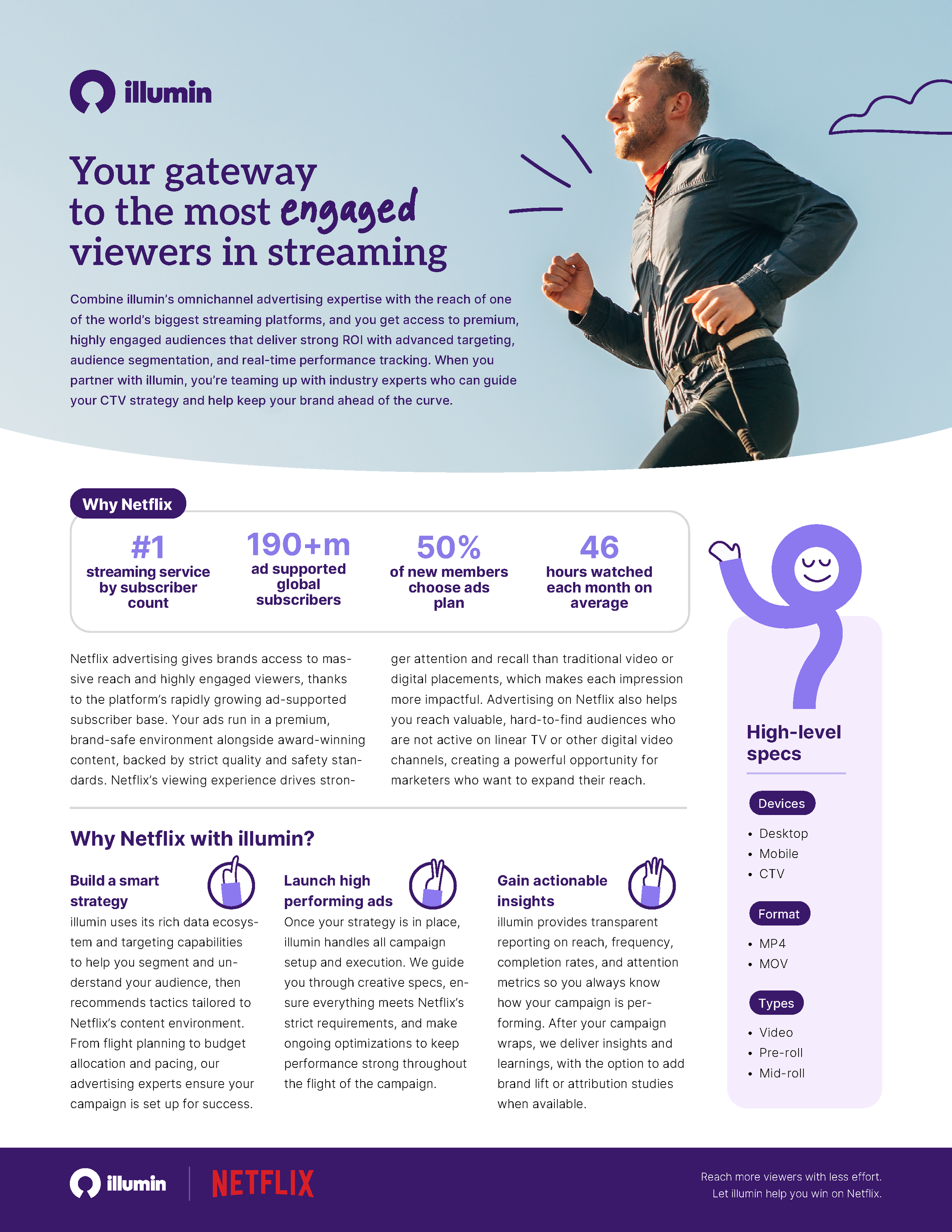
A brand campaign for illumin built around the idea of clarity. Calm, grounded, deliberately human visuals. The visual identity pairs soft lavenders and purples with open-sky photography and hand-drawn flourishes, bringing warmth to an otherwise technical product and speaking directly to a female marketing audience.
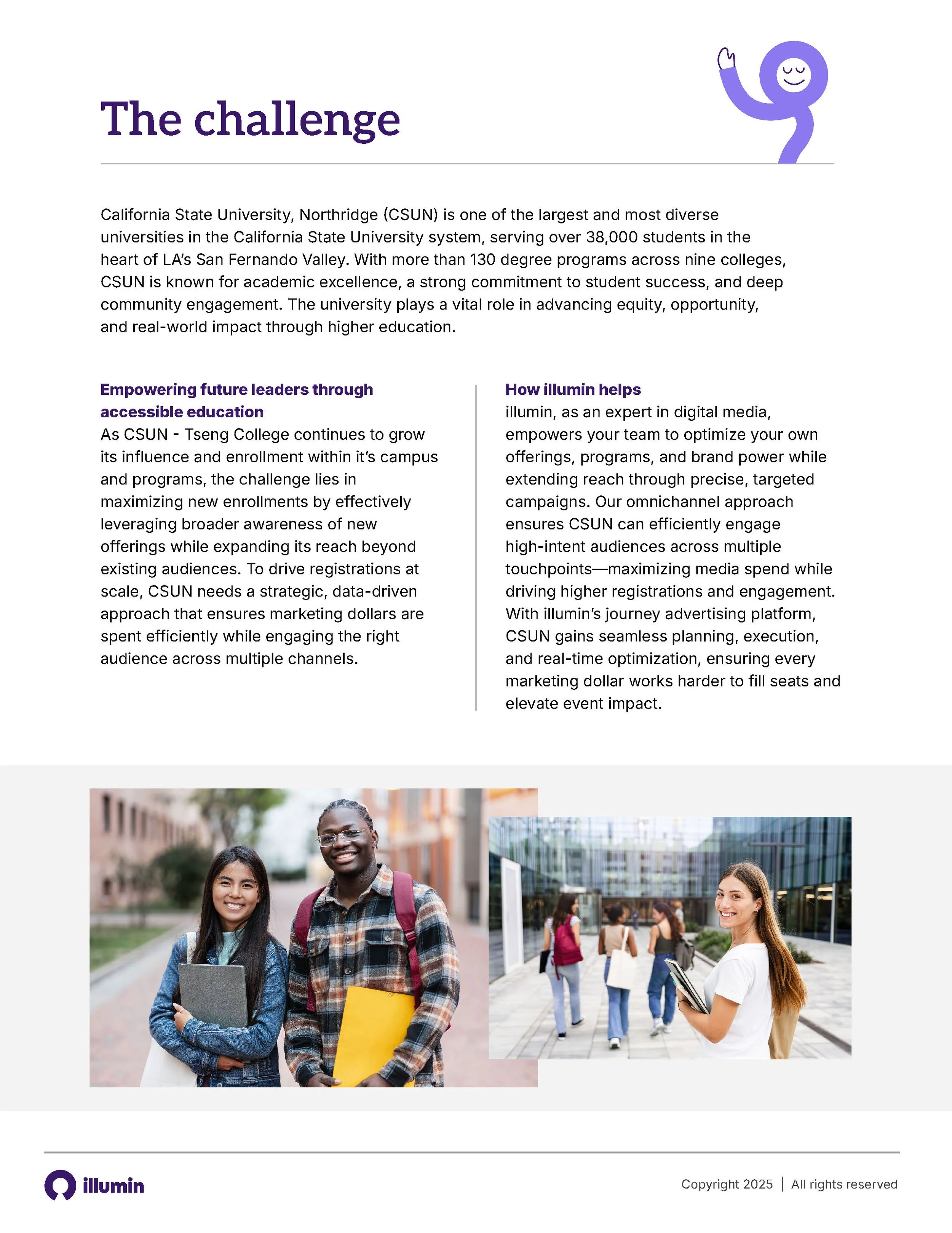
This campaign for illumin centred on a refreshed brand identity rooted in the idea of clarity — the feeling of finally understanding your advertising strategy at a glance. The design language was built to reflect that: soft lavender and purple tones, airy photography of people outdoors, and generous white space all contribute to a sense of calm and openness that sets illumin apart from the cluttered, data-heavy look common in adtech.
Bringing clarity, warmth, and a human touch to adtech.


Where programmatic advertising meets a little humanity.
A key part of the identity was bringing a human touch to a technical platform. Hand-drawn flourishes, including illustrated clouds and handwritten callout words woven into headlines, were created to add personality and warmth. The imagery was intentionally grounded and relatable, with a particular focus on resonating with female marketers.


The identity was rolled out across a full suite of materials including digital one-pagers, emails, trade show banners, and presentations.