
illumin had grown considerably since its early days as AcuityAds, but its visual identity hadn't kept pace. The existing brand felt generic, lacking the confidence and distinctiveness needed to compete at an enterprise level. The goal was a complete rebrand that would position illumin as a bold, forward-thinking platform.
illumin Rebrand
Standing out in a crowded SaaS market with a brand that had lost its edge.
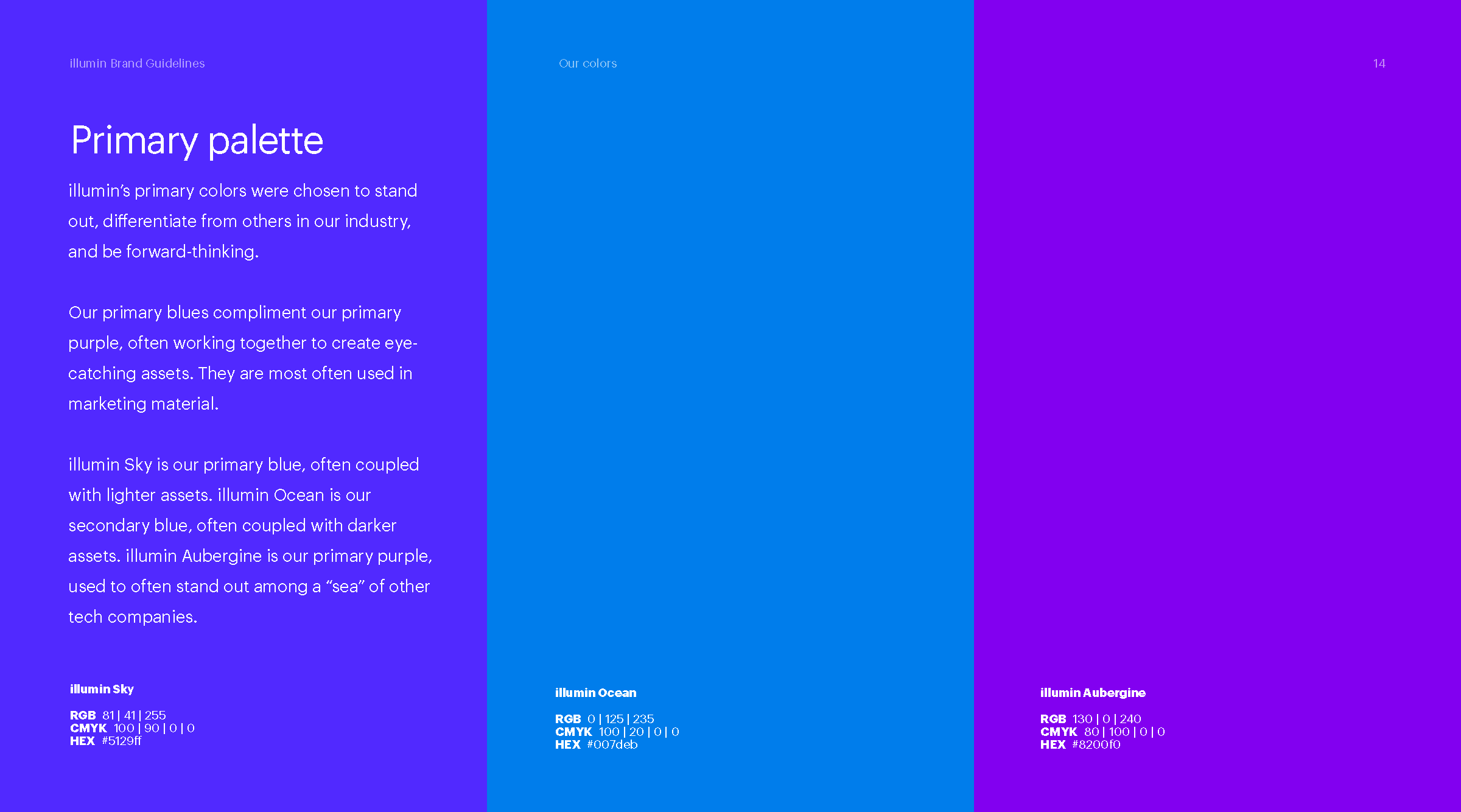
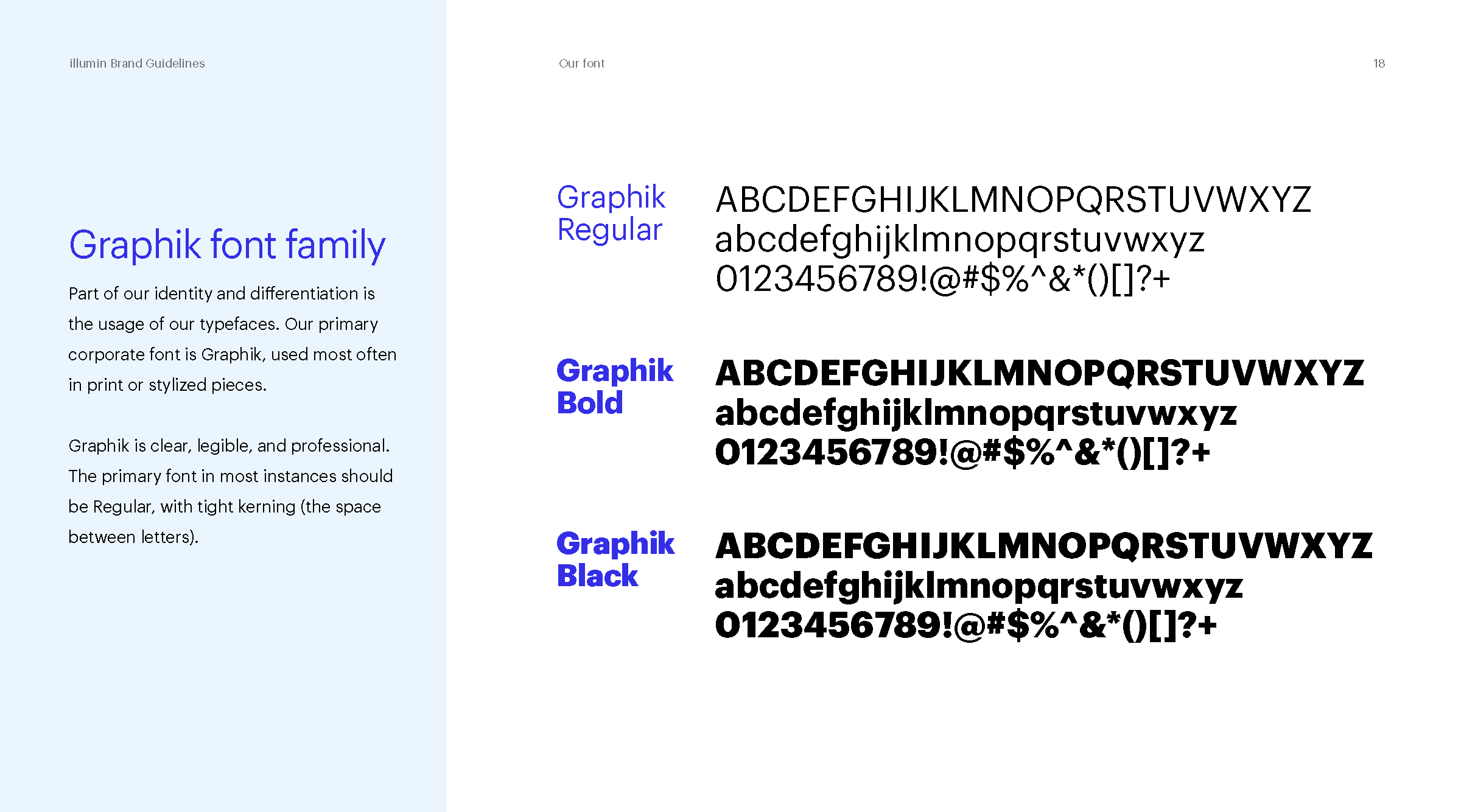
I established a new primary colour palette anchored in deep, confident tones with bright accent colours for energy and contrast. Typography was overhauled to use a bold sans-serif display face paired with a refined body type for legibility across all touchpoints.
The new identity was rolled out company-wide through a comprehensive brand guidelines document, a redesigned Google Slides presentation template, and updated collateral across digital and physical channels. The rebrand underpinned illumin's subsequent marketing campaigns, earnings reports, and promotional video work.


Building a cohesive system from the ground up.
The company’s sub-brands also required a rebrand to accompany the parent brand. Covering illumin's podcast, in-person events, and internal programs, I designed these brands to be unified through a shared "journey" motif: path-like graphic symbols that could function as standalone marks or combine with wordmarks seamlessly.


Making the platform make sense.
illumin is a SaaS platform that does a lot. Part of this rebrand was to create a video that distills its capabilities into easy-to-digest visuals.
I designed the video as a guided walkthrough. Features are in plain language, paired with a visual representation that let the viewer see what the platform does. The illumin brand carried through every frame: bold type, considered colour, and simple animations to represent concepts such as drag-and-drop, or the proprietary “pathlight”.